Conceptual

For this assignment, I had five words to combine in a photography: Forest – Kneel – Pleasant – Camera – Love.

At first, here were original sketches. Yes, I have great drawing abilities! I decided to go with #1 to tell the story of this semester in this photography class. As I started shooting, the story of the concept became deeper and deeper.

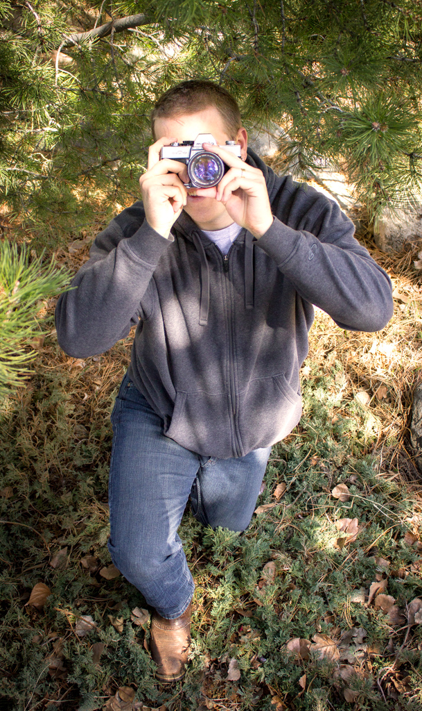
As you can see, this photo was taken in the woods, has a pleasant mood, and portrays a model kneeling. This is for the technical side of things.

Now, what is my concept saying: This semester was an incredible learning experience that was made even more magical by the help and support of my sweet hubby. Every time I would go out, he would accompany me, give me suggestions, and stay late to support me. I wanted to take this photo with him holding a camera for once. The sparse patches of light going true the branches and lighting his clothes make this photo dreamy! I couldn’t have made it through without him.

This shot might not be the most technically advanced but it has a deep meaning to me which is what matters to me.

This photo is brighter than wanted because of the printing process which will make it darker. I liked the purple of the lens and I hope it will pop even more with the print. I burned the edges to emphasize the focus on him and the camera.

Posted in Uncategorized | Leave a comment

Fine Art Print – Result

Hi Everybody! This post is the introduction of my fine art print for this semester. ” Rest after the Storm” is the pick! This image was actually picked during the Bannack Contest. This shot is attractive to me and the public because of the unique angle from which it was taken. For the story, this photo was taken at Bannack Ghost Town and I did have to sit in a puddle of melted snow to get this angle! The composition turned out great! I was able to make his boot the main focus and his sleepy body in the blurred background. I really like the story this photo tells: a long walk in the snow ending with a well-deserved nap.

When it comes to editing, here is what I did:

  • I increased the saturation.
  • I burned the edges of the photo.
  • I sharpened the boot.
  • I straightened the photo.
  • I darkened the space between the boards of the house wall.
  • I added some shades to the boot.
  • For the print, I used the “content aware” tool in Photoshop to add space on the right and left of the cowboy to avoid tangents.

BEFORE

AFTER

To hear my comments about this print, watch this video:


I believe the following photo was taken by Caryn Esplin of this print displayed at the Spori building at BYU-I for the Bannack COMM300 contest. te photo of the old piano on the right is by Victoria Stokes.

Posted in Uncategorized | Leave a comment

Fine Art Print

Which photo do you think would be best for a fine print? Thanks for your critics and suggestions!

Posted in Uncategorized | Leave a comment

Photo Book – Episode 1

I chose to showcase my photos by using a white background. I like minimalism and clean line. I am hoping to keep this book simple but powerful

Of all assignment, I preferred the themed series at Bannack so I chose to start with that. That car was so awesome. I added a full-bleed of the truck at the back of the book to complete the front. I reduced the opacity of the text box to make the display more homogeneous.

Owen is so focused in the shot. I found it appropriate of the table of content. For my book, I focused on using the font Century Gothic.

This spread is refreshing after rust and black & white I think!

The credits wasn’t easy for me, and I am planning on changing some of the wording. It was really hard to find a portrait of me!

Posted in Uncategorized | Leave a comment

Tasteful Typography

I enjoyed the perspective of 12 assignment so much that I wanted to try again with another subject at Bannack. As you will see in my first photo, I chose this because cars are part of the legacy my dad transferred to me.

For this series, I used the Sync function in Lightroom. I saved a lot of time!

helene-clements-lock

To be able to see the paragraph in the shot below, I overexposed half of the photo. I also tried it with white writing and darker background. I think I like the black font better. What do you think?

helene-clements-old-car

helene-clements-old-car-2

I love this quote! This is how I feel with this car, even though this is old, when you old the wheel, yous till feel like you can go anywhere!

helene-clements-lewisquote helene-clement-front helene-clements-back helene-clements-bolt helene-clements-derriere helene-clements-seat helene-clements-side helene-clements-trunk helene-clements-wheel helene-clements-window img_2709

Posted in Uncategorized | Leave a comment

Bannack – Creative

LEVITATION: This is my levitation shot. Ana was so patient and creative. I had a little fun in post and added element to her persona with Photoshop.

img_1815 img_1818 angel

GHOST SHOT: with Erin. I see miners to have a really tough life that they want to get out of. This is what this photo portrays. Being a miner is not glamorous. It’s tough, it’s painful, and dangerous. I blended coal texture to the background.

ghost-4-0

ABSTRACT: This is macro of a piece of wallpaper. Good old MADE IN USA.

img_1910-2

CONCEPTUAL: a news paper of the mining town.

img_2601-2

COMMERCIAL: This is the actual slogan of MJB Coffee used in a commercial in 1986.

img_2563

Posted in Uncategorized | Leave a comment

Bannack – Fine Art

This is a side view of the old car by the saloon. I had a lot of fun looking at several perspective of the object. I love the goldish tone of the light.

img_1837

Again, from the car. This is a macro with burnt edges.

img_1865

This is a seat in the church. I accentuated the moldings and made then slightly more gold.

img_1957-3

This is the brand on the fire place in the building left to the hotel. I loved how cool it looked.

img_2549

This is such a great item! This alcohol make or whatever its name is is the symbol of incredible era.

img_2580

Posted in Uncategorized | Leave a comment

Bannack – Portrait

We were so lucky to have all these models at Bannack. These are only few of the portraits I took.

This portrait of Erin was made using a gold reflector. I slightly light up the photo and added burnt edges.

img_1999

This photo is so fun. Sister Esplin directed me to capture this giant in front of the hotel. Here we used a silver reflector to light up his face.

hotel-portrait-correct-size

For this portrait, we had a Rogue Flashbender directed at the model’s face. It complimented well the light coming from outside.

img_2029

This portrait focuses on his boot. Only natural light was used. I can picture this scene in a real Far West town.

img_2058

This photo only counts on the soft light coming from the window. I increased the exposure on “Hagrid” face and tried less saturated tones for a more dramatic and authentic effect.

img_2407

Photo of the wonderful models that helped us out. I pumped up the saturation and created a blue sky.

img_2517

Posted in Uncategorized | Leave a comment

Macro Week

I really enjoyed this week’s assignment. I do recognize that it was harder not the use the automatic focus. However, it was a lot of fun to try different things. I am so excited that I can now take photos of details I always wanted to capture. I ordered the Vivitar close-up lens and they worked out great. I mostly used +4, and +10. I only used Lightroom for my editing.

This is a photo of a tulip. I edited it by increasing the saturation, the sharpness, and the exposure. The water drop shows the other tulips. I also burned the corners of the photo.

img_1604

In this drop, you see more grass and the next door apartment complex upside down! For this one, I increased the saturation, and burned the corners of the photo.

img_1650-2

I took this photo in class of a bowl full of buttons. I increased the saturation on my main subject and decreased it for the surrounding buttons. I increased the sharpness on the owl and the clarity.

img_1517

The photo of this grapefruit slice is backlit. I love how the light brings up the details of the texture. I increased the saturation of the rind. I also increased the contrast and the clarity.

img_1692

The photo of this reel seems so cool to me. The +10 close up lens tends to blur the edges of the photo (maybe it’s because I use it wrong haha). I burned the edges of the photo.

img_1527

This is a photo of my grandma’s musical box. I burned the edges of the photo. I also increased the saturation. I like the old fashion look of this photo.

img_1666

This is a photo of my husband’s cuff links. I sharpened the main object and cranked up the reds. I also increased the exposure.

img_1671-2

I took this photo in class. The only point in focus is center of the flower. I like how the petal edges are blurred. I increased the exposure and the saturation.

img_1530-2

Posted in Uncategorized | Leave a comment

Portraits

What a tricky assignment for me. I am not very experienced in portraiture so this week was definitely a challenge.

1. Individual – Side Composition:

Photo of a student after devotional taken on 1/31/17. If this doesn’t fulfill the requirements for the class, please disregard this shot. The student is on a third line and the background is blurry. Light editing: Higher brightness and removal of a pole sticking out of her head in the background.

helene-clements-side-blur

2. Individual – Head or Head & Shoulders:

I enjoy B&W portraits. This young boy was such a pleasure to work with. I took the shot from a lower standpoint which, you may think, is contrary to portraiture standards but I didn’t think that it was unflattering for him. I actually like having him look down at me. I added clarity and contrast and remove a big branch from the background.

heleneclements-headshoulder-shot

3. Individual – Full Body:

Several of my primary kiddos helped out on this project! Isabelle is on a third line. She looks just like a princess! I extended the snow on the left and made the blanket go to the right corner. I also added contrast.

helene-clements-side

4. Group Activity:

My brother and my sister in-law were just being silly and I luckily had my camera on! I pumped up the exposure and the contrast. I do wish my sister-in-law would be a little sharper.

helene-clements-group-candide

5. Group Posed:

Again, my sweet family helping out. I hesitated in making the background blurry but I enjoyed the sharpness of the landscape. Here again, exposure was increased as well as contrast.

helene-clements-group

6. Individual or Group Environmental:

This sweet pretty lady at Walmart allowed me to take her photo. What a gorgeous lady! Her humble kindness shows so much to me. Here again, exposure was increased as well as contrast.

helene-clements-environment

7. Portrait enhancement:

Owen had a lot going on behind him so cutout a lot of the background but left the gradient light. I made his eyes brighter, adjusted his hair, light up the trumpet, and darkened his hair and eyebrows.

helene-clements-enhacement-original

heleneclements-enhancement

8. Color Change

I changed the yellow for pink and brightened up the photo.

helene-clements-color-original  helene-clements-color-change

This is just extra! I loved this photo!

helene-clements-extra

Posted in Uncategorized | Leave a comment

Reflectors

What a fun assignment. I had no idea reflectors/diffusion could make such big difference.

For this first photo, I used the diffusion panel. It truly spreads the light and allowed me to avoid shades with her glasses just like with the photo below. Her skin looks as beautiful as it actually is thanks to the diffusion of light. The overhead lights created shadows with her glasses rims. Her eyes are also darker and the top of her head is overexposed.

With Diffusion Tool

img_1110

Without Diffusion Tool

img_1114

In this portrait, I used a silver reflector and bent it to avoid too harsh of a reflection. Adam was a great sport to help me here!

img_1091

Here, I used a gold reflector located on the lower right of her face.

img_1098

Posted in Uncategorized | Leave a comment

NEw PErsPectiVe

What an incredible week! The day this assignment was due, Elder Oaks announced the creation of BYU Pathway Worldwide. I actually am part of Pathway and will be part of the transition so, believe me, it took a lot of concentration to finish this assignment!

My ordinary object this week is the Tepito Taco Bus! I love their food and always told myself that I would love to make a photo project of their food truck. The owners were kind enough to let me capture their business. I highly recommend your trying their delicious food. It is located by the Dairy Queen. I took these photos pretty late in the day so I had to crank up the exposure on all the them. I also used the content aware fill a lot because there are multiple distracting electrical posts around the bus.

Through this assignment, I realized the limits of my camera (Canon T5 Rebel). I now know that I cannot get my ISO higher than 200 if I want to avoid grainy photos which makes it really hard to take photo in darker setting without additional lighting.

For my texture photo, I first took a photo of their logo on a door. Then, I isolated the logo from the background using the refine edge option. Finally, I added the texture to the background of the photo.

helene-clements-tepitohelene-clements-hot-saucehelene-clements-kitchenhelene-clements-texturehelene-clements-nice-ladyhelene-clements-orderhelene-clements-sign

Posted in Uncategorized | Leave a comment